Hi I’m Zoha Ahmed, a student of Political Science, Urdu and Media Studies. Since the age of 12, unlike my peers, I was compelled to look into the different perspectives of life and display them through my own eye. I started to channel my views and insights through my political blog which only strengthened my love and passion for journalism. With my interest and enthusiasm for visual arts and media, this subject seems like a more than perfect fit.
Critical Reflection
How does your product use or challenge conventions and how does it represent social groups or issue?
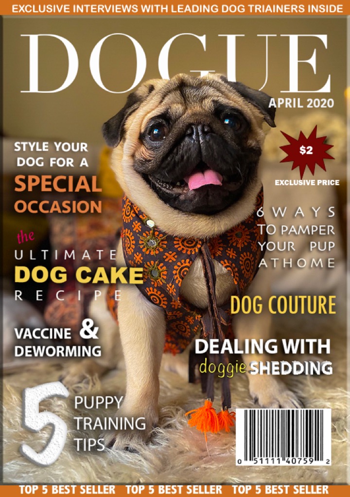
I gathered several inspirations from the internet for my magazine cover. I challenge conventions because my final product is a dog magazine which isn’t very common. The name of the magazine is ‘Dogue’, inspired by Vogue. Dog and Vogue. I chose this name because I wanted the product to appeal to the audience. The name tells how it is is a fashion and lifestyle magazine – just like Vogue, but instead for pets only. This makes the audience relate to the product more. I designed the magazine using magazine conventions like adding a bar code to give it authenticity. I played with different fonts and designs to make it look more eye catchy. The pug on the cover is wearing dog clothing to make it seem like an actually fashion magazine.
How does your product engage with the audience and how would it be distributed as a real media text?
To engage with audiences, I will use social media applications like Twitter and Facebook. Twitter’s trending page can be used as a tool to engage with audiences. The trending page allows people from all over the world to view your content. I will tweet my magazine cover under hashtags related to dogs like #doglover #dogworld #dogclothing #dogtreats etc to reach people who are interested in dogs. The product with engage with the audience because it will be targeted to dog lovers and people who frequently view dog related content online. The magazine will engage with the audience because it updates them on important dog news, trends while benefitting from useful tips. The magazine also contains a wide variety of dog clothing designs which may give inspiration for styling to users. The magazine also informs them of interesting services related to dogs like Doggo’Donalds. It also contains special discount codes which may attract many people. For the distribution, I have chosen ARY Group. The ARY Group is a famous distribution company in Pakistan based in Karachi. The ARY Group has distributed many famous Pakistani films like ‘Jawani Phir Nai Aani’ and ‘Wrong Number’.
How did your production skills develop throughout this project?
I started off with not knowing basic magazine conventions and how to use editing softwares like Adobe photoshop and illustrator. These softwares were definitely not my comfort zone when I began but through the process, I learnt to use both them and the different features they offer. They seemed complex and it took me a couple of tries to polish my skills. After all the trial and error, I feel like I have learnt how to use the main features of these softwares especially the 3D effects, the masking technique, overlaying texts, image editing etc. Looking back at my preliminary task, there is definitely a lot of improvement in my final product. From playing around with different fonts, editing techniques and placement of everything to make it look coherent, I have definitely polished my skills in production and design of prints.
How did you integrate technologies – software, hardware and online – in this project?
I used different types of technologies during the production of my magazine.
I used two different types of hardware to produce my magazine. I imported all the required content from my iPhone to my laptop and then used two different editing software to edit my magazine. I used Adobe photoshop and Adobe Illustrator. These software allowed me to choose from a wide range of options and I learnt that using different mediums is always beneficial because the options are endless.
I used online sites to gather information regarding the content I was writing on. For my centre spread, I was required to write an article for which I used the help of Google, YouTube, Wikipedia and other online sites to gather details.
This integration of different technologies allowed me to produce my magazine cover and without any single one, I would not have been able to
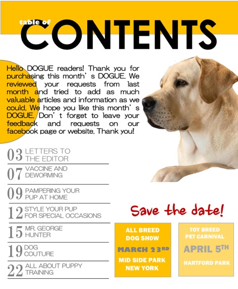
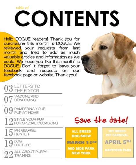
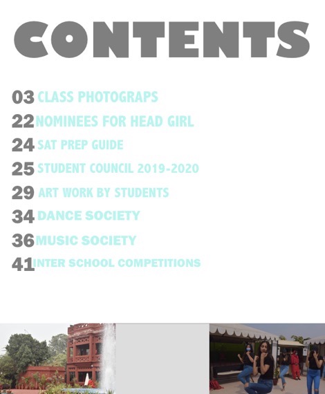
Final Product: Contents Page
Final Product: Centre Spread

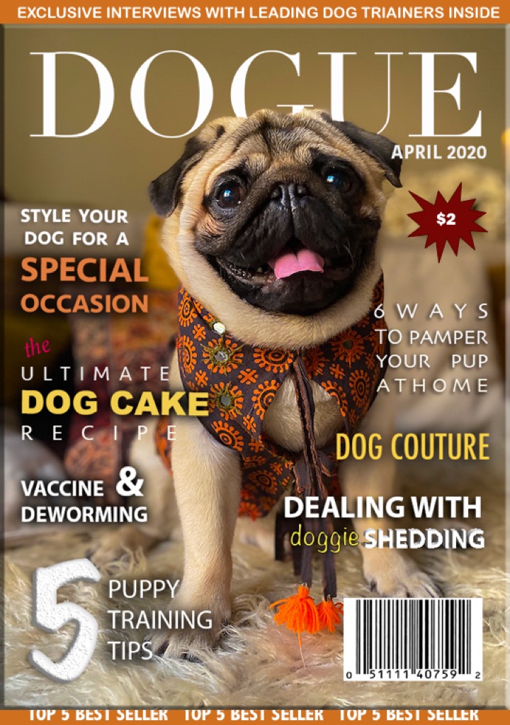
Final Product: Magazine Cover
Presenting to you my final product!
*drumroll* please
Centrespread: Construction, Redesign, Editing
I started off with a white background. I tried out different colours for the background and ended up choosing white since everything else was a bit overwhelming. Black seemed a bit too dull and orange was too in the face. Since my general theme was orange black and white, white seemed perfect.
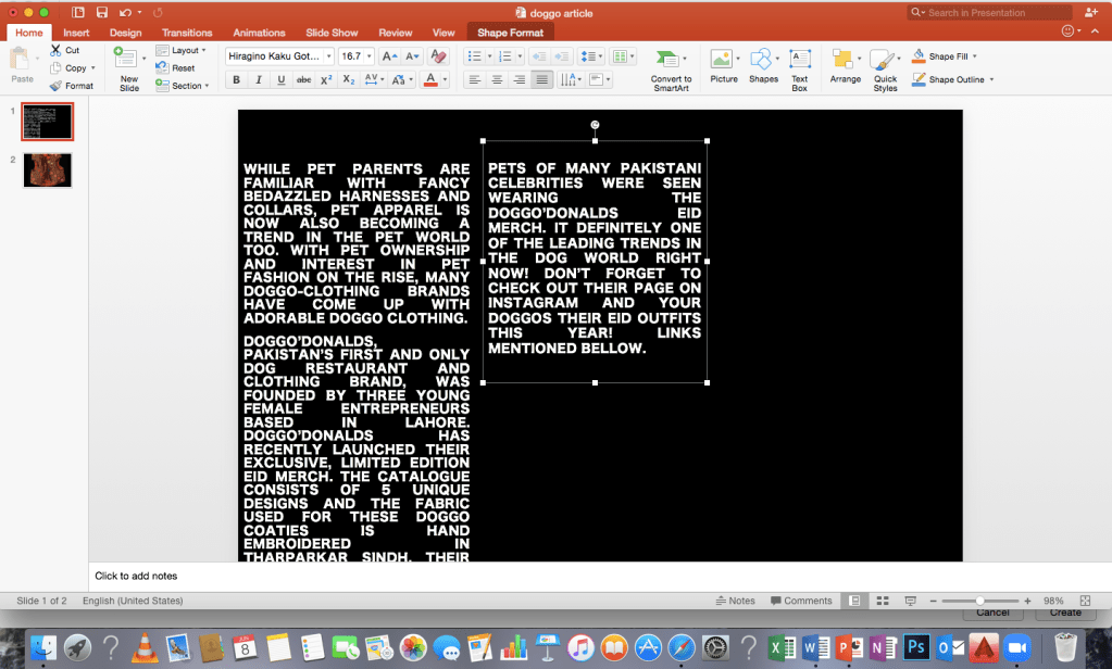
I wrote an article on power point and pasted that to photoshop. I used the ‘vector masking’ technique to delete the background of a few pictures I took. A mobile phone app called ‘MagicEraser’ also came in handy deleting the background of pictures.
I retouched a few pictures before adding them. I also used the smart objects feature. The ‘layers’ feature helped me add various elements independently in layers that I could stack up as per the order of display.
I saw some inspiration pictures online and used that to get help in placing my content on the page. I used the ‘drop shadow’ feature to blend in the text and make it look more inclusive. I tried lots of different ideas for the placement and since I had lots of material I could add to this page, I kept adding whatever seemed appropriate. I kept changing the fonts styles till it seemed appropriate. After lots of trial and error, I finally chose the placement I went for. Here are a few screenshots of the process


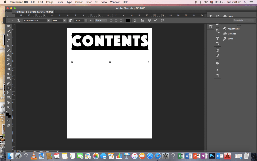
Contents Page: Construction, Editing
For the contents page, i used some other photographs i took of my dog. I added it to a plain white background and started adding the material
I changed the font and colour

i changed it back to a simple black coloured font. I wrote an introduction on the top, used a picture of my dog, i removed its background and added other material
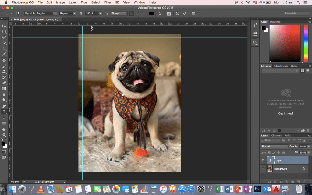
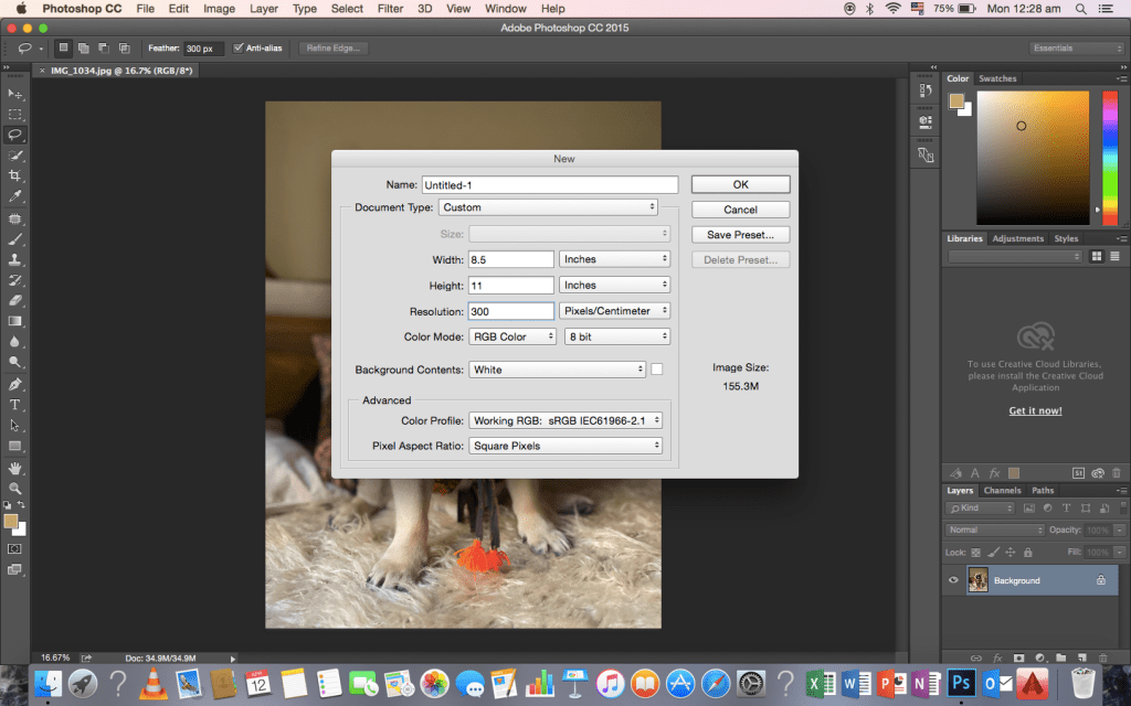
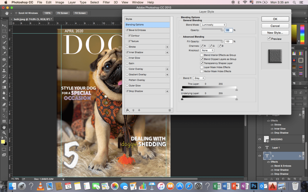
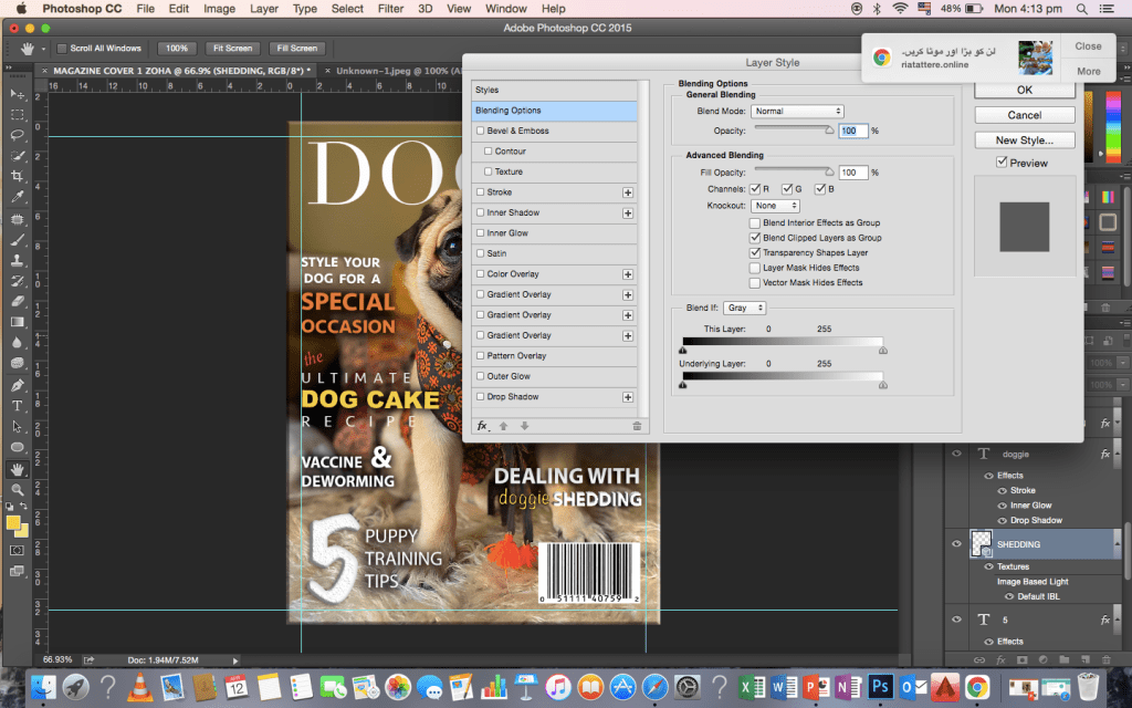
Magazine Cover: Construction, Editing, Redesign
I started off with a plain white background 8.5″ by 11″ on adobe photoshop. I added margins to make everything look neat and systematic. I then added the photo graph I chose from shoot which I previously edited on photoshop too.

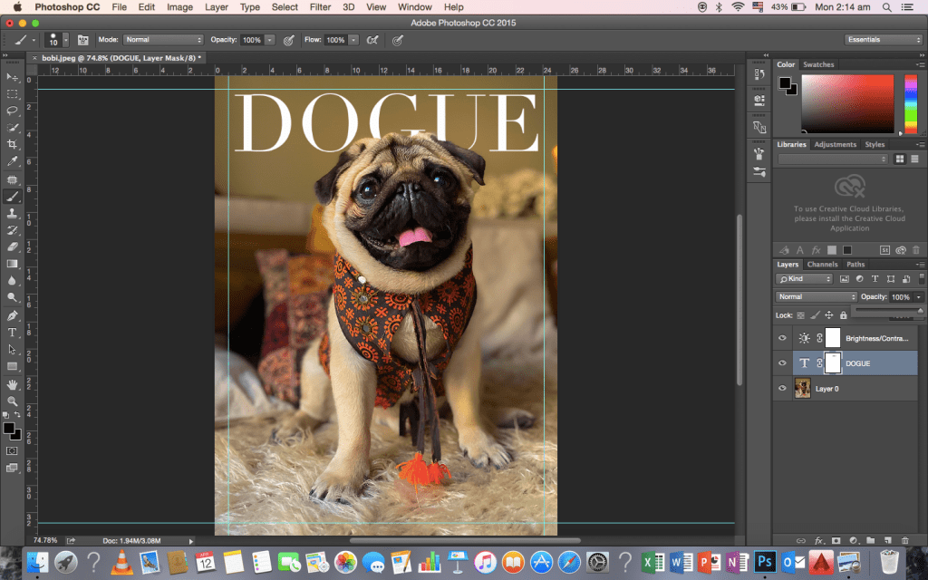
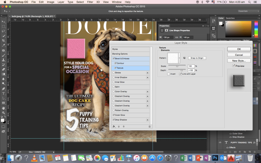
I added the logo on top. I used the masking feature on photoshop to cover the ‘G’ and ‘U’ of ‘DOGUE’. I couldn’t find the exact font used by font since it had to be purchased separately so I found one which resembled it the most.
I started adding the cover titles. I tried out all the different fonts and used the ones I liked.
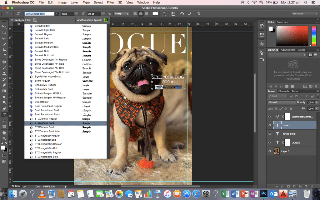
I edited the fonts by using layer style. I added ‘drop shadow’, ‘inner shadow’, ‘contour and texture’ to enhance the fonts. I played around with the different features increased the opacity of the texts. For the ‘5’ on the bottom left of the picture, I increase the texture to the maximum number to make it look a different and to stand out.

I added a bar code at the bottom right like all magazines. I blended the texts to the background to make it blend in with background.
I changed the fonts and colours of the texts. To highlight and make it pop a bit, I changed the fonts of specific words like ‘DOG CAKE’ and ‘SPECIAL OCCASION’

I kept changing the cover lines, the fonts and the colours to see what looks best but then eventually ended up changing it.
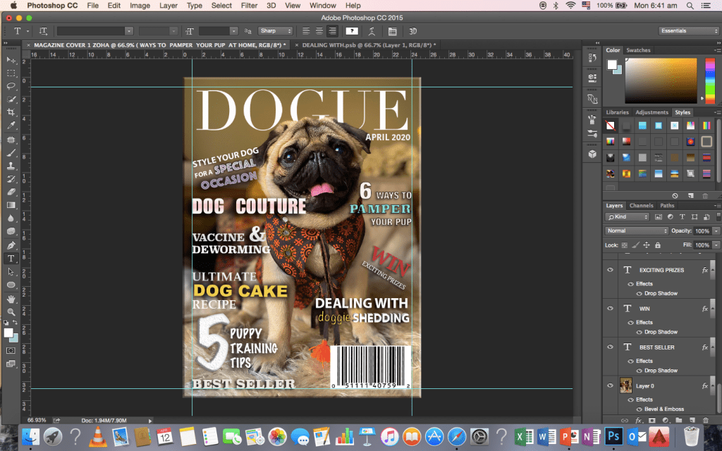

I realised this was looking too tacky so i ended up changing it. I added a header on top to tie it all together. Here is what it turned out to be
School Magazine: Contents Page
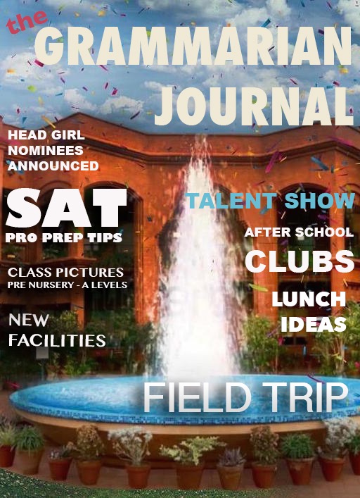
School Magazine: Cover Page
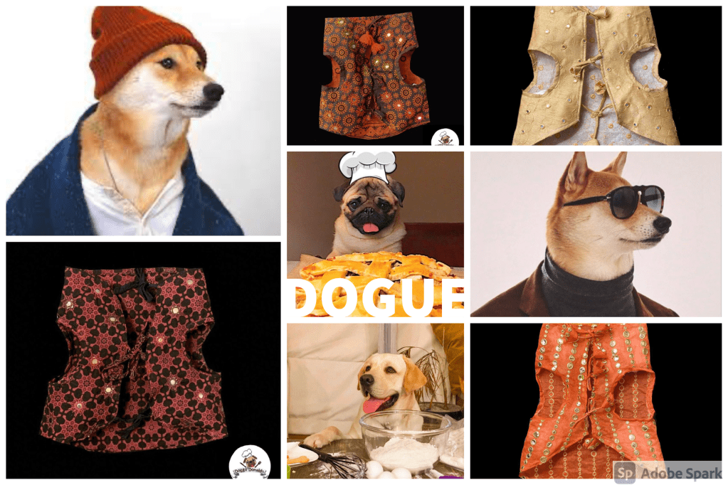
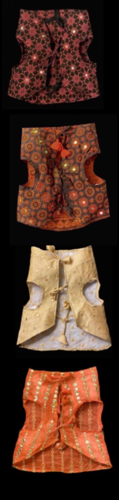
Mood Board / Costume Mood Board